Saturday, May 8, 2010

Unusual Still Life


Sea Wall
Watercolor 8.5" x 11" Matted to 12" x 16"

Our unit of study this session in my advanced watercolor classes is still life paintings.  When one thinks of a still life, a bowl of fruit is usually the subject one thinks about first - or perhaps a vase of flowers.  Based on the definition of a still life from the Tate Museum Glossary, the subject of a still life is "anything that does not move or is dead."  (I like this definition.)  :)  This definition opens up a whole new world of what can be considered a still life.    Traditionally, some objects in a still life were likely to have been selected for their symbolic meaning, but this symbolism eludes most modern day art gallery visitors.    A still life is a work of art of inanimate subjects, typically commonplace objects. 

My watercolor above, Sea Wall, is one of my favorites-- very simple still life of a sea wall with a chain and rope.

Watercolor tip:
The background of this painting used a technique that I found interesting.  The wet watercolor paint was dusted with flour in spots to add texture to the sea wall and give the illusion of age and pitting from the sea.  The paint and flour were allowed to dry and then dusted off creating some interesting texture.

Find something that "does not move or is dead" and paint yourself a still life!    You'll have fun and smile when you think of the definition!

Happy Painting!

Saturday, May 1, 2010

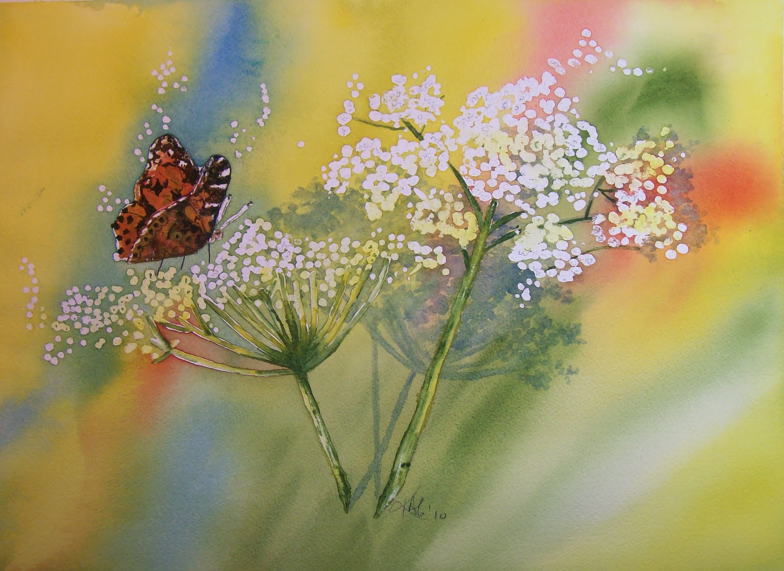
Flutter By


Flutter By
Watercolor 11" x 15" Mats to 16" x 20"

Wildflowers are starting to bloom and nature seems to be awakening!  Butterflies and birds are returning to my flower garden.  I like wild flowers;  and in my painting above, Flutter By,  I have painted Queen Anne's Lace with a butterfly sipping the sweet nectar.    One of my fondest memories of this particular wildflower was at a nature center near our home.   We took our son to the Spring Festival at the nature center when he was around 6 years old.   At  one of the exhibits they were preparing "natural" foods.  They had dipped Queen Anne's Lace in a pancake batter and deep fried it....probably not too healthy, but it was "natural."  We enjoyed watching the faces of the people who sampled the delicious "batter cakes" and then found out they were eating wild flowers.   Yum!  I figure if you dip something in batter and fry it - what is there not to like!  :)   My son thought this was great fun!

Watercolor Tip
I masked the flowers and butterfly using a liquid masking fluid so that I could paint the background easily.  I used a very wet wash of several different colors and allowed them to blend and merge as they dried.  If the colors did not blend naturally, I sprayed a little water on the paper to help with the blending.  Use a concentrated wash of color so that as it dries, it will stay bright.

Now, get out and enjoy Spring, sketch something special, and pick up that brush!  Pick a few wildflowers while you are at it.........is that batter cakes I smell!  :)

Happy Painting!


Flutter By
Watercolor 11" x 15" Mats to 16" x 20"

Many varities of wild flowers are starting to bloom and the painting above is "Queen Anne's Lace" with a butterfly enjoying the nectar.    The blurred background makes the butterfly and flowers stand out in stark contrast to the mulitcolored colored background.

Watercolor Tip:
The flowers and butterfly were masked out with liquid masking fluid to allow me to paint the background in a very wet wash of several diferent colors that blended and merged as the backgroun dried.   The flower shadows were painted with a wash of blue onto the dry background.  The shadows were painted before the masking was removed from the flowers.

Enjoy the many colors and sights of Spring!  Find something simple in nature, sketch a painting and pick up that brush!

Happy Painting!

Saturday, April 24, 2010

Big Sky

Big Sky

Watercolor 9" x 12" Mats to 12" x 16"

My watercolor above, Big Sky, concluded the study of landscape painting for this unit.   Various methods and techniques for painting building roofs were explored.  A slate roof and tin roof were highlighted in the landscape above.  Although the focus of this painting is not on the roof, knowing the color combinations for specific types of roofs play an important part of this landscape and any landscape containing a building.

Watercolor Tip:
How to paint a slate roof:
The colors for slate roofs can be described as a blue/gray. The following watercolors are often used for slate roofs:
• Burnt Sienna
• Burnt Umber
• Ultramarine
• Cobalt Blue
• Raw Sienna
Sketch a slate roof and paint using the following steps.
1. Paint the ridge tiles at the top of the roof with a medium round brush and Burnt Sienna mixed with a little Ultramarine.
2. Mix a slate gray from Cobalt Blue and Burnt Sienna or Ultramarine and Burnt Umber and paint the roof using a larger round brush.
3. Drop in Raw Sienna wet into wet.
4. Drop in your chosen mix of colors wet into wet: (Ultramarine and Burnt Umber or Cobalt Blue and Burnt Sienna).
5. Using a rigger brush or a small flat brush, add detail to the ridge tiles with this same mix of blue/gray – wet on dry.

Happy Painting!
Karen

Saturday, April 17, 2010

Twisted!

Twisted
Watercolor 11" x 15" Mats to 16" x 20"

I love the twisted truck on this tree growing by the water.  The time I spent on the preliminary sketch for this painting was not wasted time.  It would have been very difficult to paint in the twists and turns of  the truck without my sketch for reference. 

I masked in the branches and tree truck which extended into the sky and background trees.  This allowed continuity in the sky and background color.  Note that the ground is not completely painted, but many areas are left white; thus, allowing the contrast of the darker tree truck to stand out and drawn the viewer's eye to the tree. 

Watercolor tip:
To achieve a good contrast with the background and foreground and to emphasize the large tree, I avoided unnecessary background detail.  The soft haze of foliage in the background was achieved by sprinkling a little table salt onto the wet paint creating "instant leaves." 

Happy Painting!
Karen

Saturday, April 10, 2010

English Thatched Roof Cottage

On Fall Holiday

Watercolor 8" x 10" Mats to 11" x 14"

As I continue with my teaching unit on landscapes, the focus this week in my advanced classes was a thatched roof cottage.   In addition to the technique to paint the thatched roof, other techniques used in this painting include:  painting rocks, masking (the gate) scratching (highlights on the foreground branches) sponging (background tree foliage), and a wash for the fall foliage, and path. 

Watercolor tip:
I used a slightly different technique to paint the sky in this painting. I applied clean water to my sky area and while it was still glossy, dropped in Ultramarine Blue and Paynes Gray using a mop.  Instead of my usual method of painting the entire sky area and then using a tissue or paper towel to lift out the clouds, I painted around the clouds and softened the edges with a wet brush.  This helped to create an autumn sky to help put "a chill in the air" and tie in the colors of the thatched roof and the rock fence. 

Next week will conclude my series on landscape painting and we will be working on how to paint a still life in May.

Happy Painting!

Saturday, April 3, 2010

Happy Easter!

Spring Basket
Watercolor 11" x 15" Mats to 16" x 20"

May each of you have a wonderful Easter - full of joy and hope!

Happy Easter!
Karen Cooke
Brush Strokes

Saturday, March 27, 2010

Paris, anyone?


On s Street in Paris
Watercolor 8" x 10" Mats to 11" x 14"

Even if we can't visit Paris whenever we would like, we can create a scene in our minds.  I liked this simple street sign in Paris on an old stone building with the metal sign showing wear and rust.

I masked out the white areas using masking fluid---all the numbers and letters as well as the sign border edges.  I was able then to paint the blue and green of the sign without worring about keeping a straight line.  The sign was painted first, then the building.   I added the rust last.

Watercolor tip
The building background was painted and allowed to dry.  The darker green stone colors were sponged on using a simple kitchen sponge with wonderfully straight lines.  I did not mask out the spaces between the blocks on the painting. I simply carefully placed the sponge.

So, take a visit to Paris - one way or another!


Saturday, March 20, 2010

Happy Spring!

Sunny Side Up

Watercolor 8" x 10" Mats to 11" x 14"

Since today is the first day of Spring, I wanted to share a spring painting with everyone.  A Shasta Daisy is an early bloomer and is a fun and simple subject to celebrate Spring!

This painting combines details with a controlled wash.    I did not mask off the flowers but this can be done if you are a little tentative about painting around the flower.  The background is done in a wash of several colors:  blue, greens and yellows.  The green and yellow background provide an out of focus field of daisies surrounding the detailed flowers. 

Watercolor tip:
Keep the background fairly dark to lift the foreground subject off of the page.

In my area, we are experiencing a nice, sunnny, and warm first day of Spring!  I hope you are too!  If not, grab that paintbrush - Spring is only a brushstroke away!

Saturday, March 13, 2010

Coffee, anyone?


Columns in Time
Watercolor 11" x 15" Mats to 16" x 20"

Usually when someone offers coffee, it is to drink - but, not in this case! The painting above, Columns in Time, is painted with coffee. Have you ever painted with coffee? Believe it or not, it’s a wonderful medium for monochromatic artwork, with a wide range of rich brown hues.

I had a great time painting this one and enjoyed the aroma of the coffee too. I used instant coffee for my painting, but brewed coffee can be used as well. I find that it is easier to adjust the intensity of the shade when using instant. Not dark enough? Just add another teaspoon of coffee. In addition to the coffee, I only added a few touches of watercolor paint: Sepia, Paynes gray, and Hookers Green. These colors were only used in a few places - the majority of my painting was done with coffee.

PAINTING WITH COFFEE TIPS
• Change the coffee/water ratio to achieve a lighter or richer color. Darker hues will require less water than the lighter shades.
• Use 140 lb. watercolor paper, paper towels for blotting up excess coffee, and several small plastic cups to hold your "paint."
• Coffee lightens when it dries; so no matter how dark your thickest mixture is, you will probably want it to appear even darker on the paper. You will need to go over your paper quite a bit until you reach the desired appearance.
• Wait until the previous layer is completely dry before adding the next. You can use a hair dryer to dry each layer and speed the process; it works beautifully.

Give it a try.......coffee anyone?